
| Bak Magazine | they currently have 15 magazines up, each one showing a bit of artwork, some good others better. i looked at issue 15.

They have six (6) simple page layouts depending on the art.
The first is a simple image in the background with some text located in a corner etc.


| Click the image to enlarge |
The next style they use is a full page image, this douse not have any text just the art they are showing, i like this style and the above i like the fact it shows the art but douse not have miles and miles of type


| Click the image to enlarge |
The next piece is art on a single page, this all so had no text unless its part of the design, it looks fine, however unless its in a magazine you hold it douse not look right.


| Click the image to enlarge |
The next page layout is a simple quarter text, ever the bottom or the top of the page will be text, or a small strip on the right or left side.


| Click the image to enlarge |
next layout is one page text one page art, sometimes the art can be more on the text side or the design side, all depends.


| Click the image to enlarge |
and the final main page is full text page on both sides.. i added this one is just for the sake of it :)


| Click the image to enlarge |
The Styles Of Full Page Spread
so i looked at the full page spread designs with text on, and it seems that the person who was submitting there art had to also design the layout for text, unless they Bak magazine designed the text around the design.
| Click the image to enlarge |
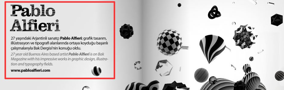
As you can see in this image, the text follows the style of the background image ( Aka the title " Pablo Alfieri " ) as a similar texture style to the checker design etc in the background.

| Click the image to enlarge |
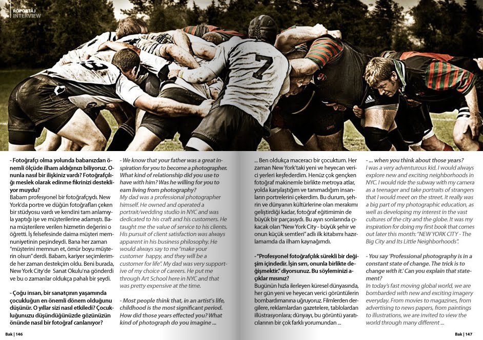
the same with this one, although you cant see on this image they blue seems to keep with one of the masks on the three (3) guys, i know its only a colour but it could still be the designers choice.
Colour Of Choice
There choice's on colours seem to be ( this is only applying to issue 15 )
- black and yellow for there cover and index page ( different colours for different issues )
- black and white for the general layout ( aka text and background " this seems to stay consistent over all of the issues " )
- Other colours they seem to use depending on the art they are writing about.
The art in this magazine is everything from photographs to hand drawings to digital art to paintings, they is a wide range of designs in the magazine, 368 pages worth to be correct.
this online magazine has some real interesting designs that everyone should see as it might inspire some inspiration.
No comments:
Post a Comment