Sunday 28 November 2010

Design | Final Magazine

DP One.


DP Two


Advert


These may change anytime, just the finals so far.

Thursday 25 November 2010

Design | Design Trends

Ok first of im not happy with this design, dousent really feel right. the idea was that the little colored tornado sort of things whats forming new trends. by mixing stuff together in a sense. however it dident come out the way i imaged it. the little logo things in the tornado think are just temps to give a general idea.


Wednesday 24 November 2010

Design | Magazine one ( Dos and donts of colour )

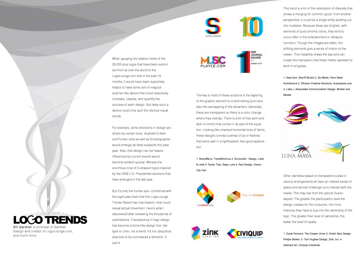
Final ( Double Page one )

on the main title paint, the white highlights are missing, i must of moved them, just a heads up if no body noticed ^^.


second one is not yet complete, nor is the advertisement.

OK well iv completed my first design for my first magazine, " Do's and donts of colour".
i found a article "http://www.inspirationbit.com/dos-and-donts-colour/" that i found quite good for knowledge of colour, quite a lot of things i did not know.

so i sat down and thought of all the things i could design towards colour E.G, rainbows, paint, drawing etc.


i dident really have much inspiration for this magazine. so i went with the paint spill since I'm quite confident with vector and i had a general idea of how it would look.

my next step before i even started was to think how would the paint look. i dident want a simple colour, eg, just red or blue etc, but i dident really want gradients ever. so i had a little play around with the title. the first thing that poped into my head was the paint interacting with the title. so i got this,


this design was after i changed the font abit, it was originally the same font all together, but i felt it dident stand out at all so i mixed it up abit. this was the first test i had with the paint idea. however i still dident like it so i added a gradient fill to give the colours something more since they was abit dull.


i then started to like it however, i dident feel like it looked like pain, it was more like shapes, so i deleted this and started fresh and got the following.


The colours was just a base print so i know how the gradient would blend with it.
Now i had the general look i was quite happy with, it was time to add the real gradient, now the good thing about this was because i used a rainbow gradient there was multiple outcomes i could of chosen. so here are afew diffrent ones.


These where not the colours i was limited to, theres millions of colours, these are just three i picked as an example.

so i went with the first one, i loved the the orange to blue with a hint of green in the center, but i felt the Donts was a bit plain. so i added some slight white highlights, to give it a slight plastic effect


so the title i was now happy with and i had my inspiration now, so i began to design. i set the size to 2xA4 together, with a 72 res


i started by adding some more paint-like effect i allso added little white bits like the "donts" to the paint effect., i needed more design aspect to give me a idea of how the text will be layed out. i all so added a small footer at the bottom of the title that the author has writ and there name.

i had this idea to have all the text on a slight slant, to make the magazine abit more interesting rather than the strait forward down text. to i started adding text using the font

"Colaborate-Regular | Bold : 21 pt / AA: crisp | for the headers. "
"Colaborate-Regular | Normal : 11 pt / AA: crisp | for content. "

I allso had the idea of using one of the colours that where in the paint effect for the headers.


so then i started building on the design, adding more information from the article i found in bits.


i then added some more paint, but i wanted a large bit to really add the effect to the page.


i then started to see the design form, i still felt that i needed abit more colour so i added abit more to the bottom left and some in between the text.


i then added the images needed for the top two right text bits, and i allso added one more text bit in for www.colourlovers.com that someone posted as a comment in this article.


i then added the last text strip in, and i was quite happy with it.


i liked the outcome, it had the information required, however i wanted to try something else. so i decided to drop the idea of slanted text strips and add just normal ones in so i did.


when i done this i manged to gain alot of extra space. and there where little strips on the website that exsplains some colours that effect you dirrently, such as red allways means angry or romance etc. so i decided to add these.. i allso changed the www.colourlovers.com to black, because i felt it made it stand out abit more.

the smaller text strips such as the effects of colour and the website.
"Colaborate-Regular | Bold : 14 pt / AA: crisp | for the headers. "
"Colaborate-Regular | Normal : 11 pt / AA: crisp | for content. "

Final


im happy with the final, i feel it may be abit to packed, but ill wait till feed back tomorrow.

Font test


Main Content
" Helvetica LT Std | Light | Bold : 21 pt / AA: crisp | for the headers. "
" Helvetica LT Std | Light | Normal : 11 pt / AA: crisp | for content. "

Sub Content
" Helvetica LT Std | Light | Bold : 14 pt / AA: crisp | for the headers. "
" Helvetica LT Std | Light | Normal : 11 pt / AA: crisp | for content. "

Wednesday 17 November 2010

Design | Magazine layout style one

This is a very simple layout style, this is not a final layout, it all depends on what the colours / images are.

Design | Font Tester

OK so iv tried a few different fonts out, to give me a general idea of how the fonts would look in my magazine


Each font is different in its own way.
the one(s) i may go with so far is, Helvetica LT Std, Colaborate, the rest feel a bit plain and not really fit for a design magazine. i may mix it up, this is just a tester to see a single font in use for everything ( for example i my use Helvetica for the headers and subbers, and Colaborate for the general text.

all the font here is default with no word spacing or line spacing.

so i then tried a general layout of both fonts on a separate page.

Tuesday 16 November 2010

Research | Bak Magazine

So i had a look over the internet for online magazines and i found one for Bak, they have a simple style of keeping it clean and repetitive ( not in a bad way ).

| Bak Magazine | they currently have 15 magazines up, each one showing a bit of artwork, some good others better. i looked at issue 15.


They have six (6) simple page layouts depending on the art.
The first is a simple image in the background with some text located in a corner etc.


| Click the image to enlarge |

The next style they use is a full page image, this douse not have any text just the art they are showing, i like this style and the above i like the fact it shows the art but douse not have miles and miles of type


| Click the image to enlarge |

The next piece is art on a single page, this all so had no text unless its part of the design, it looks fine, however unless its in a magazine you hold it douse not look right.


| Click the image to enlarge |

The next page layout is a simple quarter text, ever the bottom or the top of the page will be text, or a small strip on the right or left side.


| Click the image to enlarge |

next layout is one page text one page art, sometimes the art can be more on the text side or the design side, all depends.


| Click the image to enlarge |

and the final main page is full text page on both sides.. i added this one is just for the sake of it :)


| Click the image to enlarge |

The Styles Of Full Page Spread
so i looked at the full page spread designs with text on, and it seems that the person who was submitting there art had to also design the layout for text, unless they Bak magazine designed the text around the design.


| Click the image to enlarge |

As you can see in this image, the text follows the style of the background image ( Aka the title " Pablo Alfieri " ) as a similar texture style to the checker design etc in the background.


| Click the image to enlarge |

the same with this one, although you cant see on this image they blue seems to keep with one of the masks on the three (3) guys, i know its only a colour but it could still be the designers choice.
Colour Of Choice

There choice's on colours seem to be ( this is only applying to issue 15 )
  • black and yellow for there cover and index page ( different colours for different issues )
  • black and white for the general layout ( aka text and background " this seems to stay consistent over all of the issues " )
  • Other colours they seem to use depending on the art they are writing about.
The Art They Use
The art in this magazine is everything from photographs to hand drawings to digital art to paintings, they is a wide range of designs in the magazine, 368 pages worth to be correct.

this online magazine has some real interesting designs that everyone should see as it might inspire some inspiration.

Friday 12 November 2010

Information | My chosen Magazine Designs

Ok for my choice in designs i decided to go with

Double Page
  • The dos and Do not's of colour
  • Design Trends ( In general or mabey 2009 - 2010 )
Advertisement
  • Volvic water

Wednesday 10 November 2010

Reaserch / Design | Media City,

for media city there was only one image on my mind, and that's a building on its own world..
the first thing that popped was the British gas advert,


i find this advert to be a very creative use for such as simple thing. so i drew mine
this is not suppose to look anything like this advert, it was just inspiration.


so i drew a simple base line to get started with, this was the general idea of where i was aiming.
it was going to be gradient colors with basic shapes.

so i began the design and ended up with the following


however i wasn't happy with the way it was ending up. so i slept on it.
and when i woke i thought of another idea, similar to this one using the same colors
however it would be in layers not gradients and here is was i got.

( please ignore the horrid drawings )


it was a simple idea, similar to the own world one up above, however, it was a hand instead and
the fingers was different aspects of media, so i had a little play with photoshop to see how my idea would evolve.


( click for full size )
( quality has been reduced by blogger)

this is still not finished however its a start. the basic idea is what it says from the website, "designed around the specific needs of the creative and digital industries" so each finger represents different media, and the building(s) in the center represent media city. . i have added some boxes in representing buildings
in my photoshop version, however i can't seem to get them to fit in the design as i want.
it wasn't my original idea to have the fingers as rocks. they was suppose to be grass like the rest, but i tried it and I'm happy with it.

the only thing I'm worried about is the fingers. I'm worried that once i fill them all with a different aspect of media, you will not know its a hand. so if this happens i will have to find away around fixing the issue.

--------------------------
Added the version with the boxes to give people a general idea of what i ment


added sand in to extend the arm a bit more, make it seem a little more like a hand, and changed a few more things.


Added another finger and some more modifying. and now my mind has gone blank and i can't think of another media for a finger -_-. god help me.

"*cry*" why couldn't i be a cartoon and have 3 fingers 1 thumb -_-