Wednesday 13 October 2010

Design | A4 Prints Normal / Black and white.

Here are the color / B&W versions for tomorrow since i wont be in, im not to keen on my logo when its big. however im happy with it when its scaled down a lot more.

I may consider changing the colors a bit so they gradient a bit more in black and white.


[Click for full scale]


[Click for full scale]

Reaserch | Three CoolBrands

Well the following are the choices i have picked.


The first has to be Wii ( Nintendo Wii ) the first time i saw the wii design i wasn't very impressed however over the years the wii has become a incredible corporate identity, if you was to say Wii or if i was to see the word wii all the good memory of playing the console or just general Nintendo stuff would emerge, as i said before the logo is very simple, one of the most simplest iv ever seen, but it works for it since the console is for any age group.


Next one has to be Google. another plain logo that i still not 100% keen on, but as something as powerful as Google it would be hard to make a improvement to the look of it. them colors * Blue, Red, Yellow, Green * is to me the trademark of this identity. I also feel they know the logo is quite plain since they add a lot of different art in on the website that form in some way " Google " E.G,


like i said i believe even the creators feel its a little plain, however changing it to something better would be hard.


lastly Jack Daniels. i have always loved this brand, its simple yet a soon as you see them black and white colors with the bottle you don't even need to think what it is, you instantly know. as a logo i feel its another quite plain logo, but unlike the Google one it fits. this has to be my favorite out the three.

Sunday 10 October 2010

Research | New Name to fit

OK well as i was designing my business card i didn't feel the name really fit with the style ( Tenrex ), its a good user-name but i think that's as far as it goes. so i sat down and asked myself what would fit with the current color / theme of my design. so i replaced the Rex with pix.. " Tenpix " as in ten pixel's, aka the ten (10) circles. iv also done a " Tenpixel " Version, just to compare too.

a lot smaller for faster load-time

V1 - TENPIXEL


V2 - TENPIX


V3 - TENPIXEL


V4 - TENPIX


Design | Card, Header, Etc

My first design for my business card. the side with tenrex on i am happy with i think. however i will do afew designs of the main side to see the diffrent outcomes.

( the business card is scaled to the correct size includeing the bleed / no type zones )

Front


Back ( Version one )


Business Sheet / LetterHead
A simple business Letterhead for a business


Image overlay / Copyright
a simple image overlay for corpyrighting a peice of my work, used on a 3d model i made awile back.

Research | Logo crit

Well as i said i forgot to add any research because i added the post the night before and it was late.. bla bla bla.. so better late than never.

I dident really look on the internet much, however i did find i site that had alot of logo designs and each one was perfect.

The Link To The Website
http://creattica.com/logos/latest-designs

Here are afew logo's i found to stand out amoung them all. i will discuss what i like about each one.


BOX OF CRAVINGS
http://creattica.com/logos/box-of-cravings/44154

Simple to look at and so colorfull. i love vector / illustration art / cartoon style art. its so simple yet it stands out of the croud, it allways cheers you up and its just the best. as for the type ( Text ), its simple and easy to read with the use of " Box " in big bold letters to show you the direction to read.. and then the simple undertext to compleat it.

As for the meaning of the type ( Text ) a icecream dousent realy say box of cravings, however is it an icecream shop then its fine.. i think the box is supost to be the text and the icecream was just a adative design. but over all i still love the design.


WANNAWOO
http://creattica.com/logos/wannawoo/43822

Another Illustration like design i like. i like how the letters join together so simple and effective. i would have no idea what it would be used for ( apprently used for an iphone app ) if i dident read the information.


EATON CREATIVE
http://creattica.com/logos/eaton-creative/43195

in my personal opinion i think this is perfect.. love the use of the pencil for the slits in the "E" so so so simple yet douser the job. allso great use of text. clean and easy to read and gose with the image.


MODINI
http://creattica.com/logos/modini/42260

Another one of them amazing logos where you instantly know what the place is. ( in this case a shoeshop ), not really much more i can say apart from perfect.


ECOTASTE
http://creattica.com/logos/ecotaste/35164

And another logo the i like alot. simple strait to the point and good use of the idea.

Wednesday 6 October 2010

Design | Logo Design

This list is of the current logo designs for myself none of them are really complete, just in a state where you can get a general idea of what they logo / icon will look like.


SCRAP LOGOS - a few logos i wasn't interested in, however thought i would add them

--------------------------------------------------------------------------------------

LOGO TEN - A simple logo of TEN with the letters reversed. one with out a border box and one with.

--------------------------------------------------------------------------------------

LOGO NINE - This was an icon i was going to use without any text, its sort of a pen with slices ( needs a lot of work )

--------------------------------------------------------------------------------------

LOGO EIGHT - a simple logo of joint text saying 10rex ( number form ).

---------------------------------------------------------------------------------------

LOGO SEVEN - A logo of a pen like object with a bird on the end. lack detail yet * just to give you a general idea of the style *

--------------------------------------------------------------------------------------

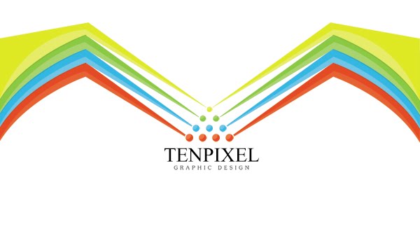
LOGO SIX - A simple logo also with circles however this has the rising. | a lot more can be done with this logo.

--------------------------------------------------------------------------------------


LOGO FIVE - A logo of some sort of plant with a paint bucket at the top.

--------------------------------------------------------------------------------------


LOGO FOUR - A simple logo with triangles that interlock each other.

--------------------------------------------------------------------------------------


LOGO THREE- A simple Logo with ten (10) circles | a lot more could detail / content could be added

--------------------------------------------------------------------------------------


LOGO TWO - Simple Logo with a box with a shader on the selected area, giving a slight 3d effect.

--------------------------------------------------------------------------------------

LOGO ONE - A simple logo with joint smooth text connecting each letter.

--------------------------------------------------------------------------------------